Fonts are an integral piece of a brand. Choice of text style has a huge impact on the ‘feel’ of a business and can connect consumers to the very core of a brand – if done right.
The options are huge, the selection is critical.
Nodifi takes a look at text styles and fonts in general, plus the ‘image’ behind them and how to select the right one for your business.
Typography vs typeface vs font
Today, the terms are often used interchangeably but they’re actually different.
- Typography means the appearance of printed words. It means ‘the art or procedure of arranging type’.
- Typeface means a group or ‘family’ of fonts. Common examples include, Arial, Helvetica and Times New Roman.
- Font, although interchangeable with ‘typeface’, means weight, width and style. For example, bold, thin, regular and black.
We’ll be using ‘font’ in this article to refer to the text style (typeface) as more people are familiar with the word.
Interestingly, the word ‘font’ comes from the Latin word ‘fundere’, which means “melt, cast, pour out”. This refers to the process of manufacturing letters in early type foundries where molten metal letter sets (fonts) were cast.
The impact of font style
The fact that many of the world’s biggest brands use only fonts in their logos, rather than images, highlights just how significant the impact can be.
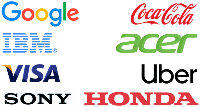
The above brands need no introductions and are instantly recognisable by their fonts despite having no other symbols or images.
Different font groups (typefaces) portray different emotions and can be tailored to a brand’s needs.
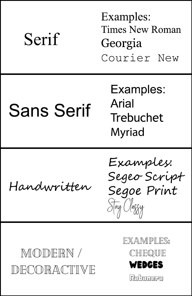
Font groups
There are four common groups. These are: serif, sans serif, handwritten or script and decorative/modern.
A quick look at font selections on Microsoft Word or Google Docs show a number of examples but here’s breakdown.
Font choices by big brands
Choosing the right font that reflects your brand is essential for communicating the correct message to customers. Below are some common fonts that well-known brands use in their logos and marketing materials.
- Myriad – Visa, Adobe, LinkedIn
- Futura – Paypal, Nike, Red Bull
- Helvetica – Target, Energizer, The North Face, Panasonic, Toyota
- Didot – Giorgio Armani, Zara
- Univers – ebay, Unicef, Western Union
Some brands, like Apple, Ford and Mercedes-Benz, among others, take fonts so seriously that they’ve developed their own custom typefaces.
If you have (a lot of) time on your hands, you can even make your own font with programs like iFontMaker.
The meaning of different fonts
As mentioned, different fonts have different ‘feelings’, i.e., they portray different emotions. This can be clear or subtle.
Here are some emotions or moods provoked by different fonts as per designmantic.com.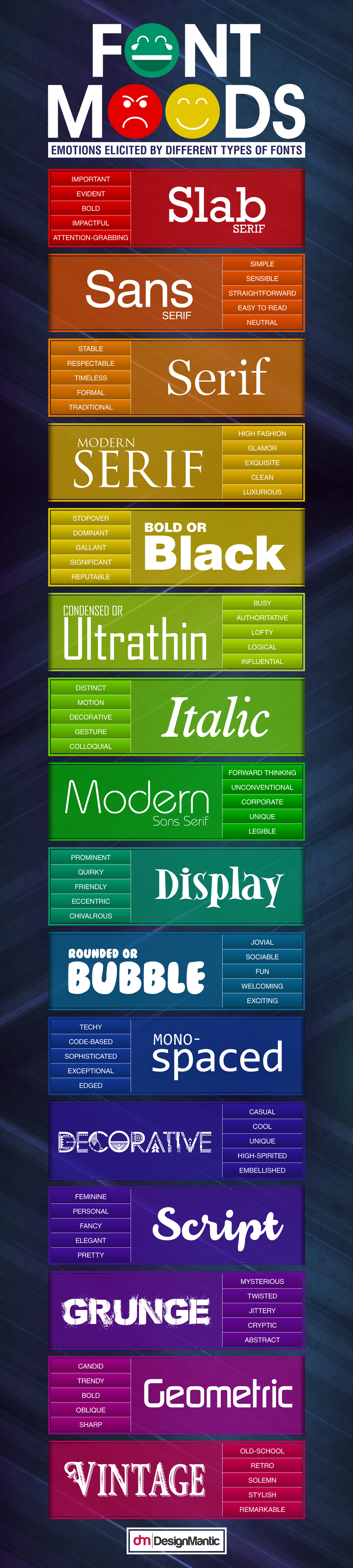 (source: designmantic.com)
Choosing fonts
Generally, businesses have two or three corporate fonts. Nodifi, for example, has two – these are Noe Display and Graphik.
Noe Display is typically used for short, bold headings (or subheadings), whereas Graphik is used for paragraph text and/or subheadings where appropriate.
Noe Display is a serif font (typeface) which evokes ‘stable, respectable and formal’ emotions.
Graphik, on the other hand, falls into the sans-serif group. This means ‘simple, sensible and straightforward’.
It’s also important to consider all applications, such as the web. A ‘standard’ website typically doesn’t have the capability to use custom fonts without some form of third party integration. Google docs is another example.
With this in mind, it’s a good idea to have standard ‘substitute’ fonts that are similar in nature to your custom font(s).
For Nodifi, Georgia is used in replace of Noe Display, and Arial for Graphik.
There are thousands of fonts out there and if one of the options offered by Microsoft or Google doesn’t suit your brand, others are downloadable.
If you’re using the Google Suite, Google Fonts may also help.
The tips below offer help when choosing fonts for your business.
Pro tips for choosing fonts
Be consistent
Before choosing fonts, remember that the choices should be consistent across all material and used for a long time. Alternating between fonts can dilute the emotions you’re trying to convey.
Choose two
A general rule of thumb is choosing two fonts, one for headings and title and the other for paragraph text.
Ideally, the one for paragraph text will be simple and fast to read.
Know your brand identity
Before you begin, decide who your target audience is and what you want them to feel when interacting with your brand.
- Take inspiration from your favourite brands, to get an idea of the image and emotion your brand is trying to convey. It can help taking a look at other large, established brands.
Keep it legible
Some fonts look amazing and really creative but are hard to read at first glance. Most people looking at your advertising or promotional material won’t dedicate much time to understanding it.
Make sure you choose a clear font that, when put in full sentences, is easy and fast to read.
They should compliment each other
Make sure the two (or three) fonts you choose look good together as well as evoking matched emotions.
If you’re not sure, these pair examples from Pagecloud might be a good start.
Using a mysterious font like ‘grunge’ from the image above, would not match well with ‘slab serif’ for example. Slab serif portrays ‘evident’.
Ask for feedback
Looking at the thousands of fonts and combinations can get confusing and tiring. Ask family, friends and colleagues what they think by preparing a few examples.
In summary
Fonts, or typefaces, are a powerful tool for a brand to quickly communicate their image and, once established, continue to do so.
Once you’ve chosen ideal fonts for your brand, programs like Canva and of course, Adobe Photoshop allow users to toggle the space between letters and lines which can again make it more custom to your needs.
Choosing the right font is an important part of any business just like the brand itself.
If you’d like some assistance ideas or more information, contact the Nodifi marketing team – marketing@nodifi.com.au
Fascinating font facts
- Comic Sans is the world’s most hated font.
- Despite the hatred it receives (especially online), Comic Sans is ideal for dyslexic children learning to read.
- Textura was the world’s first English font.
- Slanted text was invented in Italy as it could fit more words on a page, hence the name ‘Italics’.
- Early publishers kept font pieces in cases for use in printing presses. The most frequently used ones were kept at an easily accessible lower height, while the less-common fonts were stored higher up. That’s why we have upper and lower case letters – the lower case letters being more common.