Branding is ultra important for any business. It acts as a face, personality and language – things that help you stand out against competitors and gain a cut through to your target audience.
We take a look at the importance of branding.
Branding background
After a quick think and stare at the ceiling, ‘branding’ might only seem like a logo and colours – however, it’s much more.
Branding is a marketing practice that aims to identify and differentiate a product or business from others. It includes consistent symbols, themes, colour coding, fonts, layouts and language that help consumers relate to and identify a brand. It’s the process of communicating a unique selling proposition with a target audience.
These symbols, themes, colour coding, fonts, layouts and language can be displayed in brochures, advertising material, social media, websites, clothing, email signatures and more – a long list viewed by many sets of eyes.
Effective branding gives you a major edge in increasingly competitive markets. Poor branding has the opposite effect.
In the words of Editor-in-Chief of business magazine Forbes, Steve Forbes, “Your brand is the single most important investment you can make in your business.”
Examples of branding
Audi describes their branding as having an ‘iconic trademark, reduced colours, clear layout structure, a variable corporate typeface and other precisely developed elements’.
The company aims to convey their “progressive premium“ attitude across all touchpoints to ‘remain unmistakably Audi’. They avoid anything unnecessary or decorative. It’s an example of how strategic and detailed branding can be.
It means consistency in their imaging, colour choices, layouts and language in not only advertising material, but also things like emails to customers, employee name cards and vehicle owner manuals.
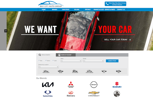
Nodifi partner, Frankston (Victoria) -based Bay City Auto Group, also displays effective consistent branding across channels. Below are three touchpoints that show consistent branding in colours, layouts and fonts.
 (Website)
 (Facebook)
 (Email Signature)
This consistency pays off. Using each touchpoint as a ‘reminder’ of your brand helps solidify your brand in consumer minds. Getting recognised is a key factor in new and repeat business.
Branding tips
Colours
According to research by marketo.com, 95% of the world’s top 100 brands only use one or two colours.
Blues and blue variants make up 33% of the top 100 brands. Reds make up 29% and blacks / greyscale equal 28%. In fourth place is yellows / golds with 13%.
Different colours elicit different responses from humans. Generally, warm colours like reds and yellows are associated with energy, while cool colours like blue and green are associated with calmness and security. Below are more specific examples;
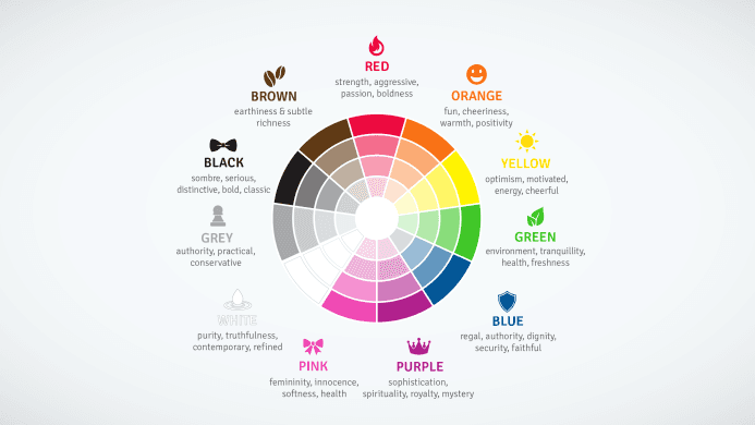
Netflix’s red logo shows energy and excitement for example. Samsung and Ford’s blues show trust, calmness and confidence. BP, despite their product, aims to come across as ‘environmental, natural and optimistic’.
Nodifi’s colours also fit in with ‘calm, progress and trust’.
- How to choose colours
Think about the ‘feeling’ you want to convey to your target customers and what specific service you offer. Make sure your colours are different from any competitors too as you won’t want to help promote their brand.
Ideally your colours won’t be too conflicting like yellows next to purples – however, there are always exceptions to the rule.
Test your colour choices to see how they match up. Contrast checker is an excellent way to see how different combinations appear, your combinations also receive a pass or fail.
Imagery
Brand imagery means all the visuals that represent your business. This might be on social media, within blogs or online content or advertising material.
Consistency is important when it comes to choosing images for a business. For example, sticking with cartoons, icons, landscapes, office workers or families. To keep unique, some brands use custom graphics too.
Imagery can have the ability to communicate whether you’re modern or traditional, simple or complicated or business or family oriented.
Some great free resources to get started with imagery include;
Unsplash
Pixabay
Pexels
- How to choose imagery
Think about your ideal client and what you’d like them to associate with your brand. Imagery can tie in with your brand’s colours too. For example, dark images like vehicles at night project seriousness and would match well with darker brand colours.
Sometimes, finance appears complicated and difficult for consumers so many businesses in the industry opt for simple icons or ‘happy family’ images.
Audiences are not a one-size-fits-all group so it’s ok to vary images as long as themes and styles remain consistent.
Fonts
Fonts (or typefaces) can have a huge impact on the way a brand communicates. They can portray a fun or quirky feeling or a futuristic or serious tone for example.
Some basic font styles and what they portray include;
Serif: classic, traditional, trustworthy (e.g., Times New Roman)
Sans-serif: modern, clean (e.g., Arial)
Slab serif: bold, confident (e.g., Courier New)
Script: elegant, unique (e.g., Allura)
Handwritten: informal, artistic (e.g., Knewave)
Decorative: stylish, dramatic (e.g., Fredericka)
- How to choose a font
Google fonts is an excellent free starting point to get an idea, there are 100s to choose from and test out. Make sure that your font aligns with other choices you’ve made with your business to tie everything together.
Having a primary font and secondary font is also recommended. This means using one font for headings (primary) and another for paragraph type text (secondary) – generally, the fonts will complement each other.
As an example, Nodifi uses Noe Display font for headings and subheadings, whilst using Graphik font for paragraph text.
Something to keep in mind is a font’s usability in the digital world (like emails and websites). For example, Noe Display and Graphik aren’t readily available across the web as standard fonts, meaning ‘substitute’ fonts are used instead. Georgia font is used for Noe Display while Arial is used in place of Graphik. Both fonts are similar in nature to their counterparts, retaining that level of continuity.
 (An example of a Nodifi social media post with the title in Noe Display and the paragraph text in Graphik)
More reasons why effective branding is so important
Branding builds trust
Clean, professional colours, imagery and fonts significantly add to a business’s credibility and trustworthiness. If new customers choose between a business with professional-looking branding and a business that’s lacking, they may be inclined to choose the first option.
Branding helps with advertising
Advertising is important in any business. With effective branding, consumers can identify your business when exposed to advertising. This helps with brand awareness, a key goal in advertising.
Branding creates loyal customers
Loyal customers offer repeat business and recommend products and services. Good quality branding can give your business a familiar human side which customers can relate to and remember easily. Branding has the ability to build relationships with customers which, along with your exceptional service, can create loyal customers.
Branding in practice
Take a few moments to look at your branding. Is it fit for purpose and effectively conveying what you want it to and to the right audience? If not, there’s nothing wrong with a rebrand, as Nodifi did in March this year. Rebranding means changing the corporate image of a business, often to better relate to its target audience.
Need help or just more information on effective branding? Contact the Nodifi marketing team – marketing@nodifi.com.au.